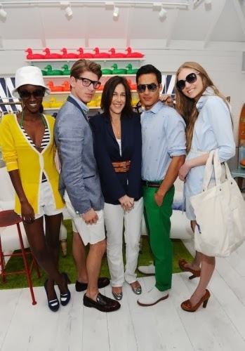
I met with a client a couple weeks ago to come up with some options to refresh their living room; new pillows, a rug and window treatment to start. They mentioned liking a "preppy" look and some items they recently scored from "C Wonder" so I took that and ran in three slightly different but also very interchangeable directions to give them options for switching out colors and patterns.
So how does Preppy play out in home decor?! The style is easily recognized in fashion by it's color scheme and graphic patterns and the look is very much to use any and all interchangeably.
You recognize these preppy colors, yes?! Really the sky's the limit as far as color goes but these classic colors seem to make their way into the look even if they may vary slightly in tone.
Pattern Play! I love that the look is created using a careful mixture of what we think of as "preppy" patterns. In design these patterns play out most popularly as trellis, Ikat, polka dot, stripe (both pinstripe and wide) and Greek key, just to name a few.
Obviously with such an array of potential colors and patterns there are many directions I could have taken these design boards but the biggest consideration was the color they already had going on in the room. Because their sofa is espresso leather, the floors are brown and the wall to wall build ins are painted in a chocolate tone we needed to bring in some lighter neutrals with our color to break up the dark and add pattern to create interest and depth. They just redid their kitchen (open to living room) with light gray cabinets and a white marble island so making sure white was in most of the living room accessories was something I took into consideration both to lighten up the dark living space and to visually pull together the kitchen space with the living room. The wall color in the living room and kitchen are a very light warm gray (Worldly Gray, by Sherwin Williams). Because of the gray walls I used more whites and beige tones as my neutrals rather than gray and charcoal tones which would have been too blendy (and yes that is not a word and my husbands hates that I put a "y" on any adjective) He might just be too lawyery to get it! (only kidding D) I should also add that my client wanted me to stay rather conservative with the color and I tried to honor that wish with the neutrals and the navy blue tones as I consider that to be a more conservative color. I did play with pattern but kept my color scheme rather simple. Also many of the pillows and rugs from option to option are very interchangeable so that they can play around with the style too. Let's do it...
OPTION 1: navy on the rug but neutral on the windows! This board I did as a more a concept board to show them what it would look like to add some more furniture; i.e. the nice big round ottoman and the sofa table/ console that I would envision behind their sofa with some decorative items and lamps.
OPTION 2: Lets add in some more color and a bolder pattern on the floor for a slightly different look?!?
OPTION 3: We use more neutrals and we get a little sassier with the prints (perhaps an animal print ottoman?!?) and then we do a very traditional white curtain and banded cornice board treatment to bring it back to classic! I also kept the pillow patterns fairly simple to marry them with the classic banded window treatment style! I love the kelly green added in and think that this color is stunning as an accent to any of these designs (notice the emerald green lamps on the first layout)!
Don't forget to follow us on Facebook & BlogLovin!!
Thanks for your support!
{Cheers!!}
Laura


You don't even know how many times I had the rug in option number 1 in my cart already. I love that pattern.
ReplyDeleteAnd option number 2 is my favorite I think. Everything is so pretty though.
I know! I love that rug too! I love the variety of patterns on the pillows on 2. that way not everything is so geometric!
DeleteI love number 1 but would add some more color from 3! Great design boards! I love the preppy look, but think I need a clients house to pull it off in... the hubs would not love so much!
ReplyDeleteThanks Tiffany! Yes I would be all for more color. Keeps things interesting!
DeleteDear Admin,
ReplyDeleteI have visited a lots of site but you are the best that I have ever seen.
I have also this related site.
Many light sources including LEDs and Incandescent lamps emit Ultra Violet (UV), Infra-red and blue and white light, which are potentially hazardous to the human eyes and skin.
Beleuchtung
Best Regards
Marlene Lorie