Today I will speak of the "Fart Zone" project!
I hope you think boys, bathroom and masculinity! As I sat down to design this bathroom plan for two growing boys in elementary and entering middle school, I came cross this sign "Fart Zone" and literally I laughed every time I moved it around on my design board. My plan for the bathroom... every detail masculine! I love masculine design but it loses out sometimes in a family home as you start to design around kids and frankly most women add feminines touch to their design even without trying. I'm waiting for someone to hire me for their bachelor pad but I'm running short on single men I know! Therefore, a growing boy's bathroom will be my space to let the pattern and texture of masculine design sing!
Masculine Design=Texture & Pattern
Color inspiration: Black, white & brown and every shade of them!
Pattern musts: plaid, check & stripe
Textures: Wood, metal & stone
I was so inspired by the school house sinks making their comeback! I love these sinks for numerous reasons. They are spacious, there's a faucet for each boy and only one bowl to clean!! Bonus all around. I love this image of the boys sharing the sink:) This is actually a triple faucet sink which is very cool too.
My vanity design is inspired by combining all the textures as a focal point of the bathroom. I like the idea of keeping the bathroom simple but loaded with interest. In masculine style you don't pull the interest from color and abstract shapes, it's classic with clean lines and a neutral color palette.
There were many tiles that I was inspired by in my quest for black & white and brown!
Love this hexagon tile! Probably a more expensive option but very cool! I love the tone of the brown too.
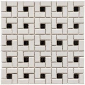
I love the idea of doing a classic black and white tile floor. The one I picked for the design was more the basket weave but there are checks, penny tiles, hexagons etc. They all are cool and great options. A note on mixing patterns and colors... Just make sure you vary up sizes on your tile. If you are doing a great big tile on the floor, maybe pick a small pattern for your wall or shower. With regard to shape, if you do the hexagon maybe pair it with the subway rectangle tiles rather than a penny tile that has the same circular look.
Here are some flooring options I liked...
I love the plaid wallpaper I found. I have also seen pinstripe wallpaper that I thought "was the business" as well and very masculine. How cool would this look on the upper half of the walls or as an accent in a boy's bathroom?!
Tile showers with glass doors are expensive!! Are they really necessary in a kid's bathroom if you are trying to cut some costs but are going for a very custom look? In my opinion, no! I think tiling a ways up the wall of your focal point area... in this case, the vanity area, is a much better way to spend money showcasing tile! I found this very masculine shower curtain. It makes a statement, is obnoxious (in a good way) and is understated in color. I also love the idea of using the copper pipe to make your own rod! You can get this stuff at your hardware store and people are making all kinds of shelving, shower and drapery rods out of it!
I also love the idea of having lockers stand in as the boring towel rack! It's also a place they can hang robes or put their individual shower items inside. I am visualizing the lockers right outside the shower. Brilliant, right?! I thought so!!
Hope you enjoyed this testosterone infused design! Shared spaces with little boys are always fun! Its fun to take cool design elements and combine them in a way they can be both stylish and playful. After all, boys will be boys! Send me your bachelors now, will ya?!
{Cheers}
Laura~


i LOVE this plan! that shower curtain is awesome!
ReplyDeleteLOve the plan too. The plaid wallpaper is so cool.
ReplyDeleteFart zone...love it
Got to have that shower curtain! What is the source?
ReplyDelete