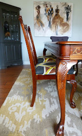
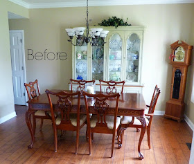
Our initial plan was to paint the cabinet as well as the table and chairs but she was apprehensive to paint the dining set as it was an antique and with the right upholstery on the chairs we could for sure incorporate the brown tones with the black and white!
I'll let the photos speak for themselves and without further ramblings~
the AFTER:
We replaced the chairs at the end with upholstered solid gray chairs to modernize the look of the table and pull in our charcoal color. We replaced the old chandelier with an over sized more modern, black drum shade! The antique chairs shown below were reupholstered in a fun modern fabric that brought our brown, black and gray tones together nicely.
The china cabinet that was painted a sage green in its original state was a little harder to make work with our plan so she had the entire cabinet painted white and we picked out a stencil to do on the back of the cabinet in a black and gold paint combination. I cannot tell you how pleased I was with the result of this piece! Its looks so much more updated and really shows off all her white china and accessories displayed!
Every great dining experience deserves a cocktail nearby! Most bars are not right in the dining room so a bar cart is always a perfect option tucked in the corner to house a few things that you don't want to get up for and they are maybe the closest most of us are going to get to having a butler! We ordered the wall mount wine rack from Etsy and the bar cart is the very popular and very affordable Target bar cart.
For the artwork we chose this very sophisticated canvas from Z Gallerie! I loved that is was large enough to fill the space on the long wall and that it did not overpower the room. I think the true showstopper should be the detail of the cabinet and everything else should fall around and compliment that! Plus it captures the scene so familiar to Tiffany of the swanky dinner parties she promised to include us in on next time...Got my gold organza gown all ready to traipse through that new space!:)
One last before and after in case you missed anything:)!!
BEFORE:
and happily ever AFTER:
Hope you enjoyed the tour! Have a great week(end)
Cheers! {Laura}


It is so lovely!! a beautiful transformation! The fabric of the chairs is sensational. I really love it. And the cabinet is fantastic. The painting is the perfect complement. Great job!
ReplyDeleteThanks Albertina! I love the way the chairs and cabinet turned out too!
Deleteamazing! LOVE the artwork!
ReplyDeleteThe stencil is glorious! Tell us about the rug!
ReplyDeleteThanks Jen! The rug was an overstock find!
DeleteLook amazing! Totally full of pops of color and boldness! Great stencil and art work!
ReplyDeleteThanks Tiffany!
DeleteThis is so beautiful! The artwork reminds me of the artist Kyle Ragsdale from Indy. I love that you mixed styles, it turned out fantastic!!
ReplyDeleteYes don't you love the art!? I need to check out this artist you speak of! Especially being local!
DeleteThe artwork! That rug! The mix of color and pattern is sooo refreshing for the outdated space! Love how you amped it up without having to overdo the design at all! Great styling!
ReplyDeletexo-Julie
Peace. Love. LOL!
Haute Khuuture Blog
Thank you Julie! I appreciate your comments!
DeleteThe designer of my dress responded quickly to inquiries and the dress did arrive faster than expected. For me it was a bit long, even with heels, and I'm 5'5. If you are petite, expect to have to have it fitted.
ReplyDeleteI think Chanel is looking at the wrong post:-) too funny. {Erin}
ReplyDeleteThat fabric on those chairs just has my heart. So good!
ReplyDeleteThanks Julia! Yes I love that fabric! It was super affordable too!
DeleteSuch an improvement. I have that triple wall mirror backordered from pottery barn for a client's stairwell so it is nice to see it hung. Also purchased that bar cart for the same client...such a steal when you compare it to West Elm identical version for twice that much and we found it on sale for $88.
ReplyDeleteYes the mirrors are very pretty! I love mirrors in doing room! They add elegance and also make the space look bigger! I hope you like them when they come in! I agree about the bar cart! This was a good one and now its on super sale!!
DeleteWhat an amazing transformation! I love all the details, especially the bar area :). I can't believe the art is from Zgallery...I never think of them and I love it.
ReplyDeleteI know linda! I love ZG! They have a ton of great artwork! Thanks for the comments
DeleteSuch a great transformation!! Love the purple chairs and wall color, especially!
ReplyDeleteThanks! The chairs are charcoal but I def see how they look a little purple! I think an eggplant color would go well in there! Thanks for your comment:) Have a great week!
Delete