In this room I let the fact that she had several sample shades of blue on the wall and her sea grass dining chairs be the fuel for my fire.
A BEFORE shot of client's dining room:
I also try to really listen to what they are saying and what they are afraid of as pushing them doesn't mean making them uncomfortable. My husband is dying right now somewhere! He might use bossy and outspoken as more fitting adjectives for his bride:) In this case I heard her say she was slightly afraid of pattern. I love pattern but it's not for me to push on someone who doesn't! So if we aren't going to let patterns make the room interesting then we better use a cool interesting shade of blue and play up our texture!!
Here are two blue contenders!

Left: "Loyal Blue" SW
Above: "Hale Navy" BM
These rich royal blues are both stunning backdrops for playing up texture and neutral colors. And even though these tones are more adventurous than some of the more grayed colors of blue she sampled on the wall, they both can compliment her traditional style.
Lets talk about her ceiling! Architecturally, it is the show stopper in the room. And the center of it is not textured! Yay! Bonus! It is a perfect spot to highlight just a touch of pattern in a very basic color scheme.
Image of her ceiling (not a great image but you get the effect)
So I am thinking we could do a pattern using a neutral color scheme and a fairly simple pattern. Maybe something like these options, either a stencil or a paper?!?


I mentioned that she has the sea grass chairs and she wants to keep them. She also wants to keep the table and is looking to have a leaf made for it so that it can accommodate more chairs. It is a small table for the room and she has a huge dining room. She is open to changing the finish of the table. So I am going to suggest that rather than staining or painting, it would look very cool bleached out to its more natural wood tone. Something maybe similar to this perhaps?! If this isn't a possibility then I think a gray washed painted or stained look would also look great. Then on the ends I would do the wing back white chairs to contrast with the sea grass armless side chairs.
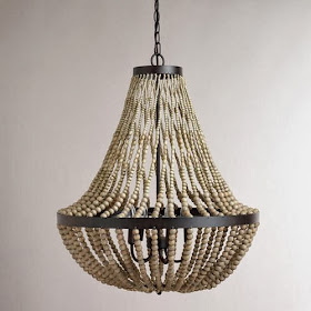
For the chandelier I was very excited to find this awesome beaded chandelier at World Market!! This is a popular look and it goes very well with the textured look we have going on! It is a great deal and it looks awesome!
Another possibility would be a lantern chandelier. I love the look of these and they go with many styles.
So now for the design boards… Below I put together two possible options with some subtle differences. In this first collage I am using the more navy version of the two blues, Hale Navy by Benjamin Moore. Because it is a more navy version I am being a little more adventurous and choosing the wine colored West Elm Stella drapes that I absolutely love!! These are such a unique color! I'm suggesting possibly a white or cream colored buffet or maybe a bar cart or glass display shelf like the one pictured for displaying bar ware. I also put the lantern style chandalier with this design board.
A closer look at the beautiful Sugar Plum, Stella (may be slightly partial to the name too) drape panels from West Elm shown in the first collage!
The next collage below is similar but adds the bolder blue paint color from Sherwin Williams, Loyal Blue. The room shown on the collage is actually done in this blue. I think it's stunning and so rich in color. I paired this bolder color with a simpler white drape panel. For something visually unique, I also suggested a buffet painted in the same color blue against the wall with maybe some over sized dramatic hardware and cool art display above it. Another cool possibility in a dining room with so much space is to purchase an old mantle and make a faux fireplace and hearth look in the dining room! The one in the collage is a mantle with stacked wood to fill in for the fireplace. Oh the possibilities!!
Here are a couple cool rooms done in this Loyal Blue by Sherwin Williams that I am suggesting as an option in the second collage!
Enjoy and Cheers!
{Laura}


I'm kinda really digging the royal blue version.Looks stunning! And I'm a huge fan of Pam's nailhead ceiling!
ReplyDeleteThanks Julia! Me too I like the bolder blue myself! We shall see:) yes that nailhead ceiling is crazy! Can't imagine the time in it but it is gorgeous!! Thanks!
Delete