If you recall Jenni had sage green walls as the backdrop of her beautiful ornate cabinetry, molding and crown woodwork in the kitchen area. In my opinion it was not a rich enough color to accentuate the detail.
BEFORE:
Because her cabinetry is cream and she has so much natural light in her kitchen, we were able to go a little darker and more dramatic with the color. I choose to go between two shades of a smokey blue gray! We had them mix Sherwin Williams colors, "Riverway" and "Moody Blue". Dramatic difference, right?!.
AFTER:
Jenni loves to decorate in the color red and already had many accessory pieces in that color so we chose a scheme that would pop the reds she loves. This rug (below) was an outstanding deal online from Rug Studio! It is huge at 9x13 and was a steal at only $500!! The sectional they had in the room took up too much space so she decided on this traditional but very trendy tufted sofa. I love the linen-like feel of the fabric and the nail head trim! The ottoman was a deal from overtock.com and is a subtle beige-gray color.
BEFORE:
AFTER:
We found the green lamp at World Market and decided on the blue shade instead of the plain beige burlap shade they had shown on the lamp. I love the look of mixing a colored base and contrasting shade for a fun look. Faux fruit is a great accessory piece to add a pop of color, and is especially fitting in a kitchen area.
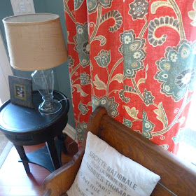
Jenni decided on this fabric of the options I found for her panels. They are a linen blend. The colors were perfect for the paint color we chose and they look stunning in there and most importantly are just very Jenni! The fabric is a Magnolia fabric and can be found at most fabric places and is fairly affordable at around $30/yard
In the kitchen nook we decided to recover the sage colored velour parson chairs (I think they were just World Market chairs) in a fun affordable leopard print that I spotted (no pun intended) at Hobby Lobby of all places. It took a little more convincing on this one but I think she is happy she went with a fun pattern! I LOVE this fabric and love it even more that it was super affordable!
We chose this simple print by Duralee (around $25/yard) that coordinates well with our color scheme, to be the roman shade fabric in the kitchen nook. Since there were several windows on this bay window style kitchen nook, a more subtle pattern would be best.
Jenni loves her new kitchen updates. We are still busy accessory shopping but is that job ever really done!?! What do you think? No major construction necessary on this one! The kitchen was beautiful but it goes to show how paint and fabric can really change the look of a space! Hope you enjoyed. Now off to my next client project!! Stay tuned! This one is a dining room and powder bath!
Enjoy & Cheers
{Laura}


I love how you kept her aesthetic, but gave it a modern update! Great work Laura!!!!
ReplyDeletethanks Melanie!
DeleteLaura - great job! It's so important to keep in mind the clients preferences and taste, right? It looks so pretty... congratulations!
ReplyDeleteThanks Stephanie!!:)
DeleteLove the wall color. But...but...but I will have to steal the sofa! The tufted sofas are my favorite!
ReplyDeleteLove it!
Thanks Julia:)
DeleteLovely mix of pattern and texture! I love the blue and the red together! Where did you get the plates on the table? LOVE THEM!
ReplyDeleteHi tiffany! The plates are from potterybarn! My friend got them!
ReplyDeleteHi...can you tell me the style number or name of that rug and the curtains...absolutely love them!! Thanks!
ReplyDeleteHave been searching for just the right blue paint, not too grey and I love the color of moody blue and riverway, the paint store won't mix them, they look a lot more blue in the photos than the sample cards. Just beautiful.
ReplyDeleteHey did you just have them mix the paint 50/50? I love the color, and my kitchen/dining area are very similar!
ReplyDelete